If the avatar is the avatar image for an individual or organization on social channels such as Facebook, Twitter, then the thumbnail is the avatar image for the video on YouTube. Video thumbnails let viewers see a quick snapshot of your video as they’re browsing YouTube, then based on the attractiveness of the thumbnails they will make a decision whether to click on your video or not.
Thus, the YouTube thumbnail is a visual element that affects the behaviour of clicking to watch a video. By now you must have figured out the importance of this factor, and investing in making YouTube thumbnails is essential for any YouTuber.
One more proof that you have to invest in thumbnail images for all videos uploaded to YouTube. That’s according to YouTube research, 90% of videos that are doing well (good engagement, high views, high search rankings, high CTR…) use custom YouTube thumbnails.
Therefore, what needs to DO and DON’T to custom a strong hook YouTube thumbnail, to get more clicks to your video? The rest of this blog of Bestcheaplikes will provide some pieces of advice to optimize your thumbnails better later on.
DO:
1. Define your own style
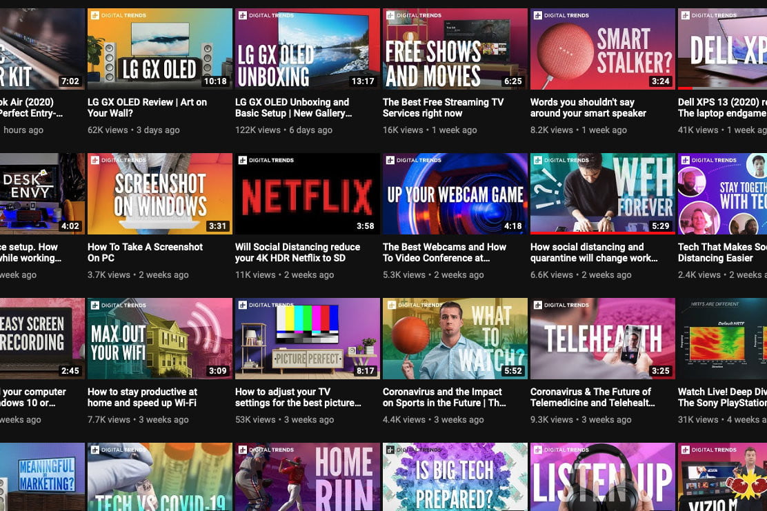
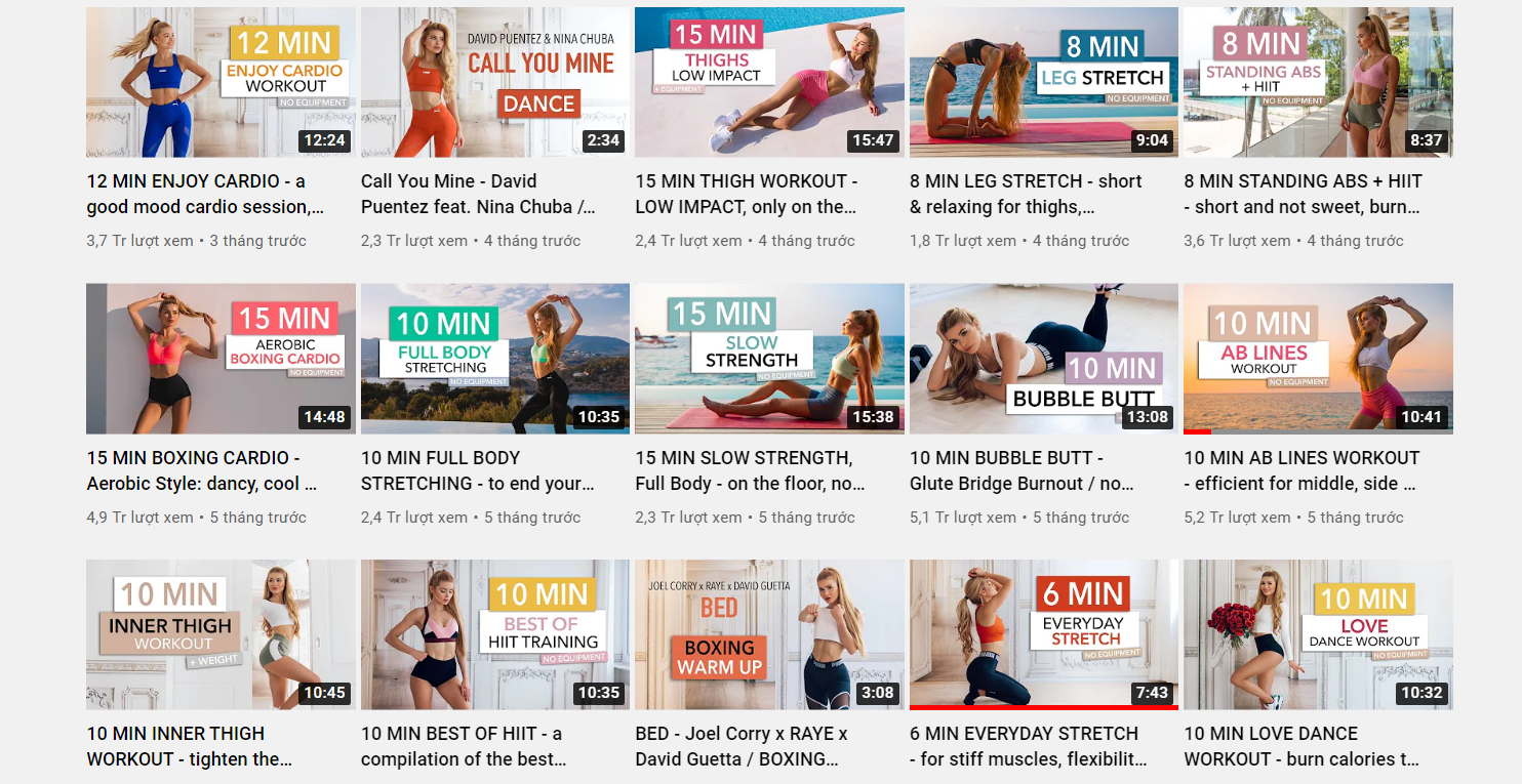
Uniformity in thumbnails is a way to show personality and let viewers know what your YouTube channel specializes in. Besides, the image uniformity also helps your channel become more professional and trustworthy in the eyes of viewers. Each thumbnail image will be different, but it should share a common design color or standard style uniformity.
Some questions you should start with before deciding on your thumbnail style
- What is your preferred branding?
Consistent thumbnails throughout your channel represent your brand across this community of millions of creators. Whether you want chic, minimalism, cool style or cartoony, think about your branding, not just for your thumbnails, but for your channel overall
- How are successful people in the same field doing?
ð If you want to be a trendsetter, ask yourself how successful people in the same field you are interested in have done before, what are the top-ranked video and what are their thumbnails look like? For beginners, copying and referencing other people’s ideas/styles is completely understandable. From there, you may have a vague idea of what style your thumbnails should be.
2. High-resolution thumbnails
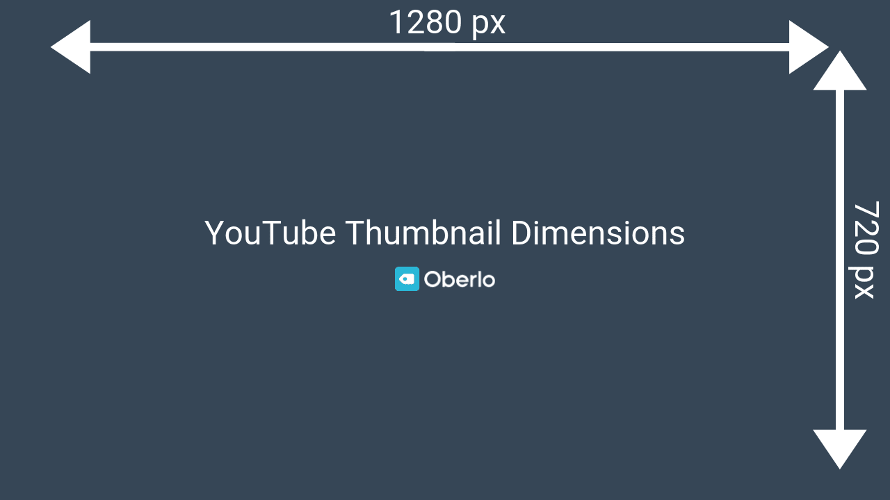
As recommended by Google support, custom Thumbnail image dimension standards should meet the following criterias:
- Image resolution of 1280×720 (with a minimum width of 640 pixels).
- Uploaded in an image format, such as .JPG, .GIF, .BMP or .PNG.
- The size is under the 2 MB limit.
Making thumbnails according to the recommended standards helps to display fully when appearing on YouTube. If the thumbnail image is not in the correct aspect ratio, YouTube will automatically crop the image in the correct 16: 9 ratio, making the image incomplete.
3. Clear layout and bold color
Where do you want to direct the viewer’s attention in the thumbnail?
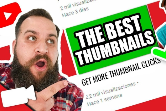
If you want to highlight some objects, subjects or details in the thumbnail, you may want to consider some reasonable options such as creating light and dark overlays, arranging image objects, using colors contrast… And in some special cases, you can also use arrows, circles, bold reds, etc. to highlight details that need attention, causing curiosity and mystery to make viewers have to click to discover what will happen in this video.
Brand elements are added to the video thumbnail as an icon, a highlight, a difference only in the thumbnail image for the videos on your channel. It can be a logo, a separate symbol, a design style… This element will help the videos on your channel have a separate “identity mark”, creating a professional and beautiful look overall. channel. However, you should consider the size, layout, and distribution of the images because this can affect the idea of the image you want to show on the thumbnails.
DON’T:
1. Abuse of text

Some people recommend that you put text in it to make the content clearer, to highlight and attract attention… However, looking back at some videos with thumbnails full of text due to rewriting the entire video title in it, Do you have sympathy and want to click to see or not? So what is the use of putting text in thumbnails? (The text shown on the thumbnail is so small that no one can read what it represents.)
Here is how to apply this more intelligently to the text thumbnail design
- Limit the number of characters. Make sure that viewers can still see the content when watching the video in the smallest thumbnail mode. The text added to the thumbnail does not necessarily represent the video title
- Big text size. Text can be just an important, attention-grabbing, content-related, streamlined phrase with large size. Elements of color, typeface, background color also need to be selected so that they can be read clearly even at small sizes…
In case if you can’t ensure the above… then it’s best there is no need to add text to your video thumbnail.
2. Unfriendly image
A friendly, interesting but still authentic YouTube Thumbnail will be an advantage to create love from potential customers.
Thumbnails are subject to YouTube’s Community Guidelines. Video will be restricted from viewing if the thumbnail is sexually explicit, violent, or contains inappropriate graphics. And to be able to load custom thumbnails, the YouTube account must be an authenticated account.
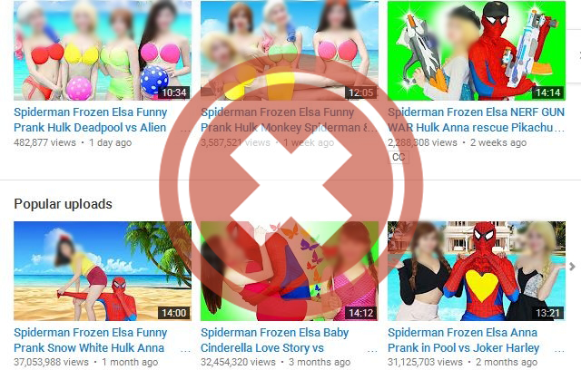
Thumbnail and title are the first and most important factors that lead to the viewer’s decision – YES or NO to click to watch your video. However, if the thumbnail reflects the wrong content (misleads the audience) it will lead to the audience abandoning your video after the first few images. This seriously affects the “viewer retention rate” metric, making this metric of the video very low…
3. Default pictures and number of episodes
It is easy to come across many YouTube channels, especially those of organizations, companies, TV stations or game channels with the content of multi-episode shows. When you visit their YouTube channel… it’s like a matrix. … The only difference between the thumbnails of the videos is… the number of episodes.
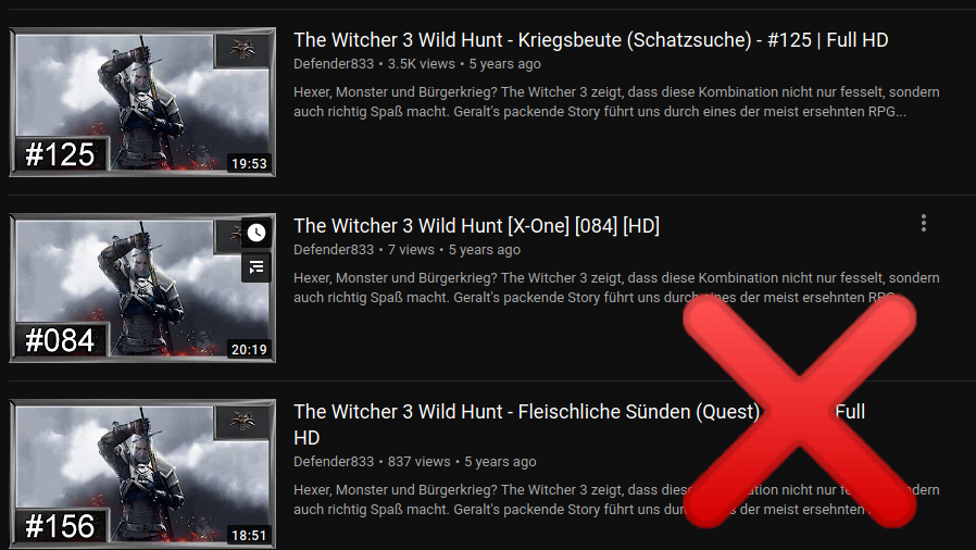
So what will attract a new audience for them, or are they satisfied just re-tapping a loyal audience – identifying clip series through consistent thumbnails and organic recommendations due to channel viewing habits… No denying that it effectively exploits the old audience and creates a good “recognition” on YouTube for them… However, every coin has two sides. Using default pictures and adding numbers doesn’t help you stand out at all.
Last Words
With the above-mentioned tips, we hope you find them informative and engaging. Take a moment to learn and testing with different thumbnails, you will see a whole lot of differences in final results, getting close to your fans, and have more chances to increase more clicks on your YouTube channel.
Otherwise, it’s time to think about using a service to boost your fans on YouTube with more likes and subscribers to stay ahead in the race. It is one of the most beneficial options to give your channel a quick push force when it is at the initial level. When choosing to buy high retention YouTube subscribers, you need to pay attention to carefully consider the supplier to ensure quality reputation. Reviewing feedback from previous customers. Moreover, adjusting your financial resources for the first purchase. Then experience the right quality and financial regulation for the next time. This avoids the loss of money that the effective quality does not have.

